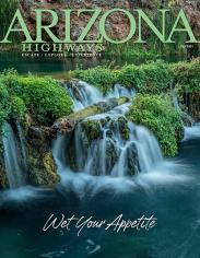

Tucson-based artist Chris Gall isn’t new to the pages of Arizona Highways. But his work on the magazine's cover? That was new.
Each month this year, subscribers to the magazine were delivered an illustrated cover of one of 12 beloved Arizona locations. Many loved the covers, which now are available as posters and as a postcard set. A few others criticized the lack of photography on the cover, but Gall doesn't seem too concerned. “Arizona Highways will tell you, they have a long history of using artwork, going back to the ’20 and ’30s, so it’s not totally unprecedented,” he says. “It’s a magazine about the beauty of Arizona. Photography is a form of art. So is illustration.”
We asked Gall a few questions about his work for the magazine's 2017 Explore Arizona! series.
What was your inspiration for creating these covers?
I had always been fond of the old travel posters that came out in the 1920s and ’30s. I always thought how great it would be to create a whole series of travel-poster-looking things, that were sort of retro but sort of modern, for the state.
Your illustrations were created from scratch, rather than photo manipulations. What was your process like?
Everybody needs photographs at some point — whether they’re mine or out in the public domain — if you’re trying to draw that something people are going to recognize. I usually drew from many sources. For example, the Grand Canyon. You can’t take a photo of that image that I created, because it doesn’t exist from any one place. I wanted to include the vista, I wanted to include the deep Canyon, I wanted to include a horse trail ... and there is no one place. That’s my job as the illustrator: to take pieces and arrange them compositionally in a way that captures the essence of it.
Once the sketch was decided on, describe your process for creating the illustration.
Using a drawing tablet, I bring the sketches into Photoshop. Getting a sense of my palette first is the most important thing: exactly what color is the sky, that sort of thing. It’s not that different from creating a painting — you’re creating a base layer and adding layers on top. The thing about digital, obviously, is that I can move things around more freely. If I change my mind, I can be wrong with much less consequence, because I can change things color-wise and move objects, something I can’t do in painting, necessarily. For a lot of my fine line work, I create it in Adobe Illustrator and then import and layer into Photoshop.
Generally, how long did each cover take to create?
Every one was different for the research part, and of course, there were a lot of sketches. I’d generate half a dozen different sketches of what I’d primarily focus on, which could take a couple of days. The actual drawing itself, on average, took five days per piece.
What was one of the biggest challenges you encountered while illustrating the covers?
One of the challenges was trying to keep a variety of color palettes and a variety of perspectives: looking down, looking up, looking from far away. It was especially challenging because there are a lot of locations in Arizona that have red rocks, and I think I had three in a row: Sedona, Monument Valley and Canyon de Chelly — all of which have reddish rocks in them. That was a big challenge, trying to keep them separate, where I wasn’t using the same reds or the same color palette.
What was it like to see your first cover published?
Great! Especially in the grocery store where it’s sitting out. I worked extra hard on the first one, because I knew the better the first one, the better all of the other ones would have to be, because I’d have to keep that same level of quality the rest of the year.
Your work is on display at ArtsEye Gallery in Tucson through December. What can visitors expect to see?
This time, we thought we would do a retrospective of not just the 12 covers, but other artwork I did for the magazine, as well as artwork that is Western-themed that I had done on my own.
— Kirsten Kraklio